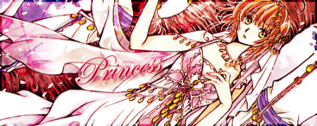
The reason I had originally kept the opacity of the 'Kawaii image board' text very low is because I wasn't sure anony wanted that text in the banner (since none of the board's original banners have that text). But I turned the opacity of it up and also downgraded the opacity of the blue glow/stroke on the 'Shuu Shuu' text.
Hope you all like it.
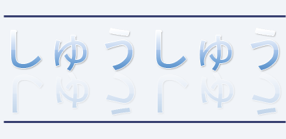
What about the internal borders on your banner, Drake?
Do you plan on leaving them there? I don't think that's a good idea. One of my previous posts explained why the image itself can't really have borders.
Very nice eichi-sama ^^
One thing I think could be improved is the area around the beginning of 'kawaii'. The blue flame thing in the background kind of hides the 'k' a bit.
Also, the background stars on the left side of the middle piece form a fairly straight vertical wall. At 1280x1024 and above it looks a bit strange. Maybe try to lessen the number or stars or randomize the placement a bit so it's not so flat (does that make sense? >_<)
Smithy,
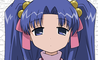
After looking over your banner again, I have found one thing I'd like to see fixed up a bit
If you look at the right side of Kobayashi-chan's head on the left image, the border between her hair in the white background looks jagged. The cut-out there looks rough. Fix that up and smooth it out and I'll add your banner to the site ^^
Eichi-sama wrote:Well i have edit this and i don't know if it was good or not.
And happy birthday shuushuu!!!!!!
Yep, that's better, I think ^^
I will add it to the site, though I have found a very small problem. On the bottom right section of the middle image, there are some light background specks where it should be white. Not enough to delay adding to the site, but please remove them when you get a chance and I will update it. Ok, thanks ^^
Interesting. Type A should work, I don't see anything wrong with it ^^
As for type B, I'm not so sure. The background won't stretch across the gaps between in the images at higher resolutions and will look odd >_<
It is possible to fill the gaps with a repeating image, but even then the ends won't meet in sync. I don't see any way for a textured background to really work at all :-/ Aside from that, the way you've split up the words between the middle and right images is unique I wonder how that'll work out. I will test the pieces at 1280 to see and let you know.


•
•