I notice that there are only three banners that rotate through on the image board.
Maybe we could have a competition to add in some new ones for the rotation? ^_^ Would any one else like this idea?
Image board banners?
-
LadySakura
- Posts: 325
- Joined: Tue Feb 07, 2006 11:39 pm
- Location: Marquette, MI
Image board banners?
The greatest thing you'll ever learn is just to love and be loved in return. <3

Yes, AnonyWould any one else like this idea?
I'll try to make something if I have the time to do so
|[ Current projects : DoujinSuki | CF ]|
-
LadySakura
- Posts: 325
- Joined: Tue Feb 07, 2006 11:39 pm
- Location: Marquette, MI

-
anonymous_object

- Site Admin
- Posts: 1584
- Joined: Tue Jan 24, 2006 2:04 pm
- Location: Good old US of A
- Contact:
Yep, this was mentioned before but never really went anywhere.
Some new banners would be nice, but they are created a bit differently. If you look at them closely, you can see that each one is actually made up of 3 separate images. This is to allow them to scale to higher resolutions.
If you slow resize your browser window, you should see how it works.
Some new banners would be nice, but they are created a bit differently. If you look at them closely, you can see that each one is actually made up of 3 separate images. This is to allow them to scale to higher resolutions.
If you slow resize your browser window, you should see how it works.
e-shuushuu!

-
LadySakura
- Posts: 325
- Joined: Tue Feb 07, 2006 11:39 pm
- Location: Marquette, MI
The Pleinair one: The left image is 188x200, the middle is 371x200 and the right one is 421x200.
The Yotsubato one: The left one is 220x200, the middle one is 429x200 and the right one is 250x200.
They're all .png images file types with transparancy so they can blend over each other. They're set up in a table, each overing 33% of the screen width.
(Anony has some impressive html skills...)
The Yotsubato one: The left one is 220x200, the middle one is 429x200 and the right one is 250x200.
They're all .png images file types with transparancy so they can blend over each other. They're set up in a table, each overing 33% of the screen width.
(Anony has some impressive html skills...)
-
anonymous_object
- Site Admin
- Posts: 1584
- Joined: Tue Jan 24, 2006 2:04 pm
- Location: Good old US of A
- Contact:
Yes, I think I wanted the total width of all three pieces to be less than 1000 pixels long. I think 800 to 900 is a good range.
The height of each should be 200 pixels.
Since the banners are 3 separate images, the background should fade into white in order to look right when viewed at a high resolution.
I guess the best way to make a banner of this type is to create a 800-900 width canvas, create your banner but ensure that there are 2 sections of emptiness where it can be cut (both cut lines should split the image into 3 approximately equally widthed pieces (like ~300 pixels each)), and then separate them while leaving as little white space on the ends as possible.
Make sense?
Any questions?
e-shuushuu!
-
LadySakura
- Posts: 325
- Joined: Tue Feb 07, 2006 11:39 pm
- Location: Marquette, MI
-
anonymous_object
- Site Admin
- Posts: 1584
- Joined: Tue Jan 24, 2006 2:04 pm
- Location: Good old US of A
- Contact:
-
LadySakura
- Posts: 325
- Joined: Tue Feb 07, 2006 11:39 pm
- Location: Marquette, MI


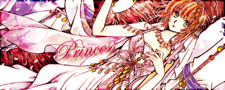
well first of all Ladysakura,I have to say sorry for the comment I will post now,it's very direct,and it may be hurting,but it's with comments like that that we improve on photoshop..
your banner is very bad done and have a lot of errors.
first thing:the font you used...it's damn ugly,too much pixellated,a color that dont have nothing to do with the rest of the pic,and the rotation is just useless,cause we cant see very well what's written,it's not something we can just stick on a website banner ,not mention that you didnt use any shadow or external light effect,wich would have been better
second thing:the characters are placed a bit too much randomly,it's somehow okay with sakura and misuzu but the sailor moon girl and kero dosent have anything to do here ,also the shadow effect is way too hard,you should have
reduced the opacity of the shadow and also added an exterenal border or external light,it's the most important thing when sticking characters in a white background
and finally:the background,well,I dont have anything to say here,it's just that the colors dont go well with sakura and it's a bit sad cause it's kinda cute with misuzu
and that's all,I hope you will not hate me for saying such things,but trust me ,it's some absolutly killing comments like that from friends of mine on my first works that gave me the will to learn more and more to try and master photoshop , and sorry ^^
as for the banner,I dont personally have the time this days but I will try and make something too ,wait and see ^^

-
Nemesis
- Posts: 534
- Joined: Wed Jan 25, 2006 5:59 am
- Location: With december at the pub getting drunk...^_^
- Contact:
damnDrake wrote:well first of all Ladysakura,I have to say sorry for the comment I will post now,it's very direct,and it may be hurting,but it's with comments like that that we improve on photoshop..
your banner is very bad done and have a lot of errors.
first thing:the font you used...it's damn ugly,too much pixellated,a color that dont have nothing to do with the rest of the pic,and the rotation is just useless,cause we cant see very well what's written,it's not something we can just stick on a website banner ,not mention that you didnt use any shadow or external light effect,wich would have been better
second thing:the characters are placed a bit too much randomly,it's somehow okay with sakura and misuzu but the sailor moon girl and kero dosent have anything to do here ,also the shadow effect is way too hard,you should have
reduced the opacity of the shadow and also added an exterenal border or external light,it's the most important thing when sticking characters in a white background
and finally:the background,well,I dont have anything to say here,it's just that the colors dont go well with sakura and it's a bit sad cause it's kinda cute with misuzu
and that's all,I hope you will not hate me for saying such things,but trust me ,it's some absolutly killing comments like that from friends of mine on my first works that gave me the will to learn more and more to try and master photoshop , and sorry ^^
as for the banner,I dont personally have the time this days but I will try and make something too ,wait and see ^^
 [br]
[br]Ow, that mean boy.. 
You should use that to test your banners (and to see how it works), just replace the img file with yours.
You should use that to test your banners (and to see how it works), just replace the img file with yours.
|[ Current projects : DoujinSuki | CF ]|