Looks like some good improvements on the previous version LadySakura!
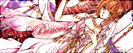
Mhhh, the text doesn't look all that smooth yet, the coloring is rather bright so it looks a bit offset agains the white background to me. Perhaps you can try and adapt its opacity or use colors that will blend in some more? Or use an outer shadow instead of an outer stroke, that usually makes the outline less hard...
As for the shadows behind the characters, it makes them stand out quite a bit... what would it look like if you downgraded the opacity of the shadows or simply omitted them? How would that look?
It could turn out well, maybe you can try that...
The yellow of the hearts is very lively but it could conflict in coloring with the blueish color theme of the frames and post background on the image board... how about something more pink, like in your signature? It's a bit of a softer color.
Have you thought about making different versions? I mean, both Sakura and Misuzu look so cute, you could make a version with only Sakura in it and one with only Misuzu in it (like a pattern with a close up of the character on one side and a more distanced view of them on the other side of the banner).
Hope these ideas may be of some use to you. Have fun working with the images, because that's what it's all about!

Iiya! With LadySakura's avatar I always think she looks like Sakura from "Tsubasa Chronicle" who is so kawaii. *Huggles Sakura* love love desu!


